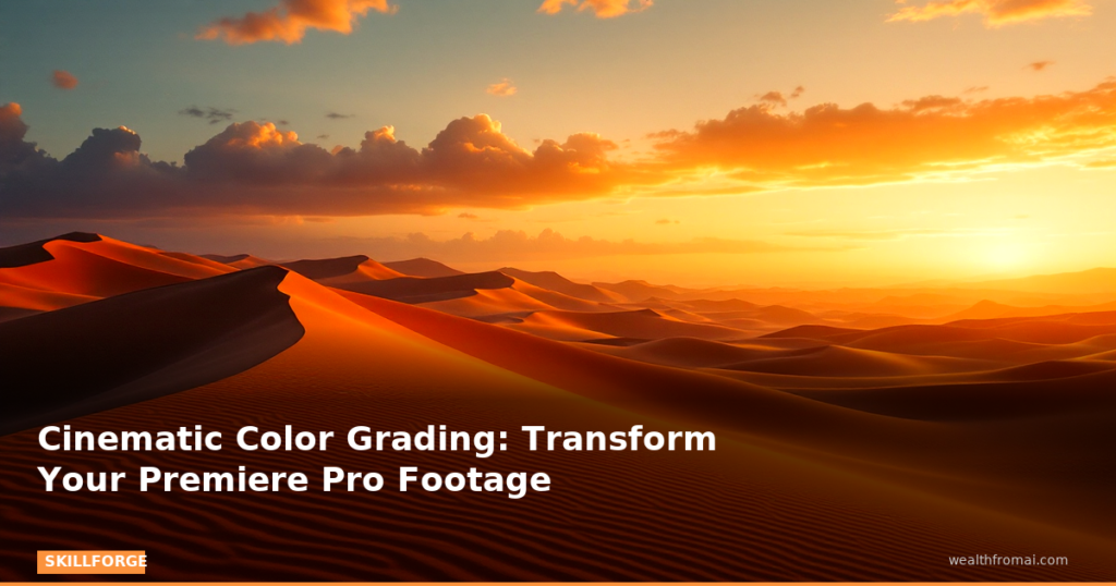
# From Flat to Film: The Complete Guide to Cinematic Color Grading in Premiere Pro
**You've shot the perfect scene. The composition is stunning, the lighting is intentional, and the performance is raw. But when you import your footage into Premiere Pro, something feels… off. The colors look flat. The skin tones are muddy. The emotional impact you felt on set has vanished into a sea of digital mediocrity.**
This is the moment every video editor faces—the painful gap between what you captured and what you envisioned. It's also the moment that separates hobbyists from professionals.
The difference? **Cinematic color grading.**
While basic color correction fixes technical problems (exposure, white balance, contrast), cinematic color grading is an art form. It's the deliberate manipulation of color, contrast, and mood to evoke specific emotions, guide the viewer's eye, and transform ordinary footage into a visual experience that feels intentional, polished, and deeply immersive.
In this comprehensive guide, you'll learn the exact workflow used by professional colorists working in film, television, and commercial production—all within Adobe Premiere Pro. We'll move beyond slapping a LUT on your footage and praying it works. Instead, you'll develop a repeatable, professional-grade system that gives you complete creative control.
By the end, you'll never look at your timeline the same way again.
—
## Section 1: Setting Up Your Color Grading Command Center
Before you touch a single slider, you need to understand that color grading is a technical art. The most beautiful grade in the world means nothing if it's built on a foundation of inaccurate information.
### Why Your Eyes Are Liars
Your eyes adapt to color constantly. Look at a white wall under warm tungsten light, and your brain tells you it's white. Look at the same wall under cool fluorescent light, and your brain still tells you it's white. Your camera, however, records the truth—and that truth often looks wrong.
This is why professional colorists don't trust their eyes alone. They trust **video scopes**.
### The Holy Trinity of Scopes
Set up your Premiere Pro workspace by going to **Window > Lumetri Scopes**. Right-click inside the scopes panel and enable three critical tools:
1. **Waveform Monitor:** This shows the brightness (luminance) of every pixel in your frame, displayed left-to-right. The bottom represents black (0 IRE), the top represents white (100 IRE for broadcast, 109 for digital). A properly exposed image should have detail throughout the waveform without clipping at the top or crushing at the bottom.
2. **Vectorscope:** This circular display shows color saturation and hue. Skin tones should fall along the “flesh line” (a diagonal line between yellow and red). The further colors extend from the center, the more saturated they are. For natural-looking footage, keep skin tones within the center two-thirds of the scope.
3. **RGB Parade:** This breaks your image into red, green, and blue channels displayed side-by-side. When your white balance is correct, the three channels should overlap at the same brightness levels in the highlights and shadows. If one channel is higher than the others, you have a color cast.
**Pro Tip:** Keep your scopes visible on a second monitor or docked to the side of your timeline. Reference them constantly, especially when you're tired or working in a room with colored walls that might influence your perception.
### The Adjustment Layer Workflow
Before we dive into grading, implement this non-negotiable workflow: **Never grade your original clips directly.**
Create an **Adjustment Layer** (File > New > Adjustment Layer) and place it above your clips on the timeline. Apply all Lumetri Color effects to this layer. This gives you:
– **Non-destructive editing:** Your original footage remains untouched.
– **Consistency across cuts:** One adjustment layer can grade an entire scene.
– **Easy comparison:** Toggle the layer on and off to see your before/after instantly.
—
## Section 2: Primary Corrections—Building the Foundation
Cinematic color grading always starts with primary corrections. Think of this as balancing the scales before you add any creative seasoning.
### Step 1: Exposure and Contrast
Open the **Lumetri Color** panel (Window > Lumetri Color) and navigate to the **Basic Correction** tab.
Start with the **Exposure** slider. Use your Waveform Monitor to push the brightest parts of your image to around 90-95 IRE (leaving headroom for highlights). Pull your shadows to around 5-10 IRE. This creates a full-range image with detail throughout.
Next, use **Contrast** to shape the tonal curve. A common mistake is adding too much contrast, which crushes shadows and blows out highlights. Instead, use the **Whites** and **Blacks** sliders (which only affect the extreme ends of your histogram) alongside **Highlights** and **Shadows** (which affect the mid-to-extreme ranges).
**Practical Example:** Imagine you're grading a dialogue scene shot in a coffee shop. The actor's face is in the midtones, but a window behind them is blowing out. Instead of pulling down overall exposure (which makes the actor too dark), pull down the **Highlights** slider and lower the **Whites** slightly. This recovers the window detail while keeping the actor's face properly exposed.
### Step 2: White Balance
Use the **Temperature** and **Tint** sliders to neutralize any color cast. Watch your RGB Parade: when the three channels align in the highlights and shadows, your white balance is correct.
**Practical Example:** You shot a scene under mixed lighting—cool daylight from a window and warm tungsten from a practical lamp. Your footage looks orange on one side and blue on the other. Use the **White Balance** eyedropper tool and click on something that should be neutral gray (a white wall, a gray card, a white shirt). This gives you a starting point, then fine-tune manually until the RGB Parade shows balanced channels.
### Step 3: Saturation
Add a touch of saturation (5-15%) to bring life back into your footage after correcting exposure. But be careful—over-saturation is the fastest way to make your footage look amateur. Watch your Vectorscope and keep colors within the middle ring for natural results.
—
## Section 3: Creative Grading with Color Wheels, Curves, and HSL
Once your foundation is solid, it's time to add emotional depth. This is where you transform technically correct footage into something visually compelling.
### The Color Wheels: Shadows, Midtones, and Highlights
Navigate to the **Creative** tab and expand the **Color Wheels & Match** section. You have three wheels controlling different tonal ranges:
– **Shadows:** Add cool blue for a moody, nighttime feel, or warm amber for a nostalgic look.
– **Midtones:** This is where skin tones live. Be subtle here—even small shifts dramatically affect how natural faces look.
– **Highlights:** Warm highlights (golden, peachy) create a sun-drenched, inviting feel. Cool highlights feel clinical or cold.
**Practical Example:** You're grading a horror short. Add blue to the shadows (shift the shadow wheel toward blue) and pull down the shadow brightness slightly. This creates deep, ominous darkness. Leave the midtones neutral to keep skin tones natural. Add a tiny amount of green to the highlights for a sickly, unsettling feel. The result? Instant atmospheric tension.
### Curves: Precision Control
The **Curves** tab gives you surgical control over both luminance and color.
– **RGB Curves:** Click to add control points on the diagonal line. Pull up to brighten, pull down to darken. An “S-curve” (steeper in the middle, flattened at the ends) adds contrast while preserving highlight and shadow detail.
– **Hue Saturation Curves:** These allow you to target specific colors. Want to desaturate only the greens in a forest scene without affecting skin tones? Add a control point at green, pull it down. Want to make reds pop in a sunset? Push the red saturation curve up.
– **Hue vs Hue and Hue vs Luma:** These let you shift specific colors or change their brightness. Use Hue vs Luma to make a blue sky slightly darker (adding drama) while keeping everything else unchanged.
**Practical Example:** You have a product shot of a red sports car, but the red looks orange-ish. Go to **Hue vs Hue** curves, click on the red range, and drag slightly toward pure red. Then use **Hue Saturation Curves** to boost red saturation slightly. The car now looks vibrant and accurate, while the rest of the scene remains unchanged.
### HSL Secondary: The Secret Weapon
HSL Secondary is your most powerful tool for targeted corrections. It allows you to select a specific color range (based on Hue, Saturation, and Luminance) and adjust only that area.
**Practical Example:** You're grading a beach scene, and the actor's skin looks too red from sunburn. With HSL Secondary:
1. Click the eyedropper and sample the red skin area.
2. Use the **Hue** range sliders to narrow your selection to red tones only.
3. Click the **Show Input** checkbox (turns the selected area white) to see exactly what you're affecting.
4. Reduce **Saturation** slightly and shift the **Hue** toward yellow to neutralize the redness.
5. Feather the selection with the **Blur** slider
Get the AI Edge, Weekly
The tools, tutorials, and trends that actually pay — no hype.